Hi Guys,
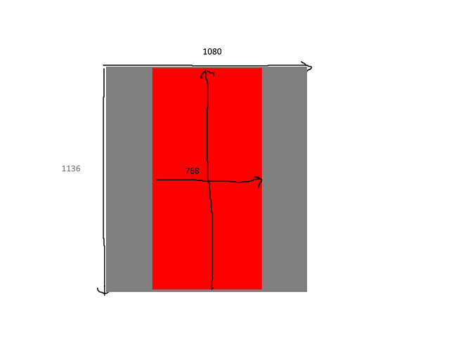
I have managed to confuse myself once more. In my project the designer has prepared all the assets to the resolution of 1080px x 1136px. I want to used this resolution but if the actual screen is narrowed than 1080px (say 768px), I just want to see a middle section that is 768px wide and 1080px high. Anything outside this area should not be shown.
Here is a pic to describe what I need.
I have tried with different cc.ResolutionPolicy’s but I just get all the either borders where I don’t think they should be or sprites overlapping. It’s like I just want a window into the area the device will support.
Can anyone tell me the best way to go about it?
Thanks
Tim

