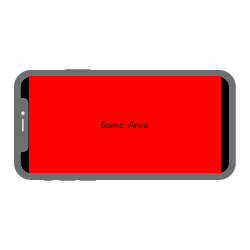
I need to fit the game in different devices, including iPhone X, XR, XS, and because of their notch, I need to detect the orientation of the device to adjust elements accordingly. There are UI elements on both sides that will be affected by the notch
The simplest solution should be adjust the width on both sides so it shrinks and leaves 2 black bars. However I tried cc.view.setFrameSize and it only leaves a black bar on the right side, because the game is drawn from the bottom left which makes it not centered.
So I try to keep the game to full screen, but then I need to detect the orientation of the device (landscape left, landscape right) so that I can adjust the elements on both side dynamically, like some game does (elements on the notch’s side will move towards center a bit).
How can I get the device’s orientation? or is there any other better method to do this?
Let us ask @Big_Bear for advice here. I know how we handle this in Cocos2d-x but not Creator.
so my boss now require me to shrink the width on both sides as state in the “simplest solution”, so I think one of the solution is to change the storyboard on xcode. I am able to change the launching screen storyboard, but it only changes the size of the launching screen. Where can I change the storyboard of the game itself?
Also I need to change the size for iphone X series ONLY, I know vary for traits allows changing some of the devices only, but iphone XS is linked to iphone 8
Hello, do you need to adapt to the current game is the horizontal screen or vertical screen?
btw my cocos creator version is 1.10.2
Okay, I get it.
The following settings can be made for iphoneX crossscreen game adaptations in cocoscreator.
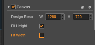
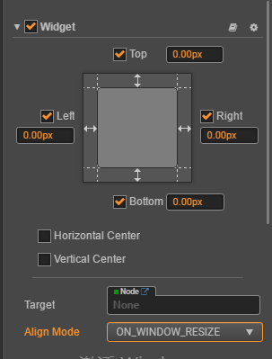
Under Canvas, select Fix Hidth, which is an automatic adaptation width scheme that will make the game design resolution full of screen height, and then use the widget component for adaptation,
You can make the width of the background image larger to ensure the width of the entire screen
1 Like
I am able to use @Big_Bear’s method on some scene, but my colleague wrote some scripts for auto layout which make it not working on some other scene.
Inspired by this, I took another approach: create a background node with 0px all side widget under canvas, then put all other nodes under canvas to this node. by editing the widget, I can shrink the layout on iphoneX. for the nodes that standby outside the canvas, I added a mask to hide them when they are outside the background node. not the smartest approach but hope it works well
All roads lead to Rome.You can try it.