I have a scene where the canvas size is that of an iPhone 6. If I fit width and height so that the aspect ratio is locked when I use the app on a different device which has a slightly different aspect ratio I get black bars at the side. I thought the best way to solve this would be to un-tick fit width so that the canvas will overflow to fill in the black bars. This would be fine as my background UI goes beyond the canvas size anyway.
However the problems comes when I do this as on screens with different aspect ratios the canvas is aligned to the left instead of to the centre. This means it fills in the black bars on the right side of the screen and all the buttons and labels in my scene which should be central are off centre. Why does it automatically align the canvas to the left and not the centre? And is there a way of fixing this?
screenshots might help folks visualize.
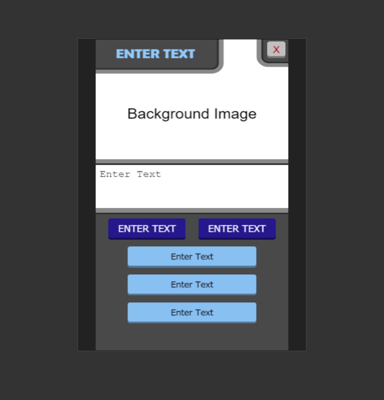
Ok this should help, the canvas is sized for an iPhone 6 screen ratio so when viewed on a 6 it fits perfectly. The fit width and fit height are ticked so that the aspect ratio stays locked. As an example it is shown on an iPhone 4s which has a different aspect ratio to the iPhone 6:
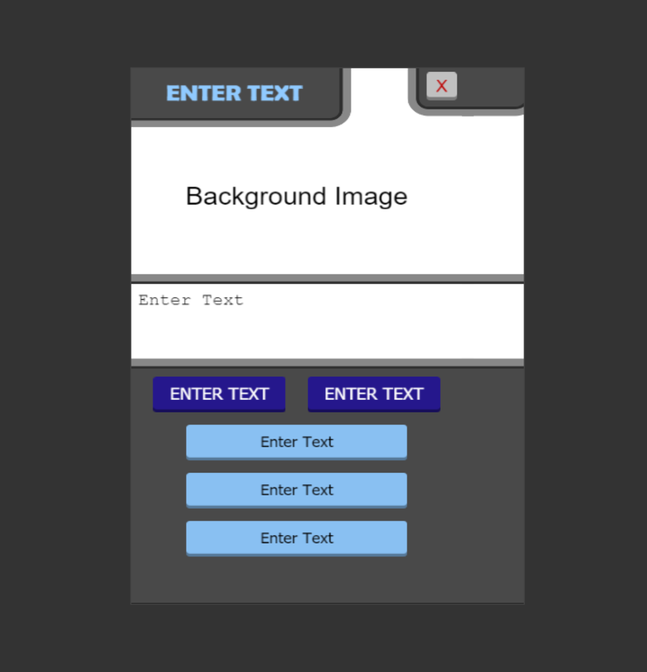
This causes there to be black lines down either side of the screen. Therefore I assumed un-ticking fit width would solve the issue as it would overflow the canvas to fill in the gaps which is ok because my UI goes beyond the canvas anyway however it does this:
It aligns the original canvas with the left side of the screen and fills in all the empty space on the right side meaning everything is off centre. Can you not make it so it aligns the canvas to the centre and fills in equally either side of the screen?
Hopefully that helps to explain the issue.