
I have to say, this is one of the best thread ever on these forums
In which regards?
a question was proposed, an amazing answer given, people learned something, the dialog continued after.
@padmnabh you might find this helpful: http://iosres.com/
It always helps me see resolutions of devices easier so I can look at the decisions I am making with design resolution.
Looking bad means whole design looks squeezed and the rectangle images looks weird that’s the case when I want it full Screen using policy Exact FIt. When I use ShowAll it crops some Nodes of border and in other resolution it will show black border around. Which all seems to be working Ok as they are mentioned. What I am stuck is at which one to choose to make Universal app or do I have to make different Scenes for iPad and iPhone.
Well I am not saying that that’s what cocos it self shows as all the Docs are shown as Outdated > Multi_resolution_support.
@slackmoehrle Thanks for the link I have gone through it but was still not able to make dicision though
Well this one is absolute best question’s which is still helping after so long.
From the link Detailed Explanation Of Multi Resolution Support I had perspective that in Fixed Height the width is changed in design resolution to match the same height and then everything is displayed on the screen but I see my view being cropped from right side.
For the Fixed Width It should have done similar with height but instead it just shows black border above the screen while preserving the actual design.
Either I am understanding the things wrong or something else any body can explain the possible scenario will be great.
As the aspect ratio of all devices is not the same, it is not possible to create one single set of resources that are guaranteed to look right on every device.
e.g. if you have a 1024x768 background and display it on a 1024x800 physical screen, you must either have 32 pixels worth of black bars top and bottom, or lose some pixels from the left and right (sorry, can’t be bothered to do the maths to work out how many!)
You could scale everything from one set of resources - and if you wanted to do so and not have black bars, then you would need to design your resources at a resolution that, when scaled with the selected policy, will never give you black bars (assuming you want to avoid them, anyway)
So the aspect ration of your design is the important thing.
How are you positioning your sprite?
I am using Cocostudio for positioning i Don’t do that through code.
ahhh that makes it hard - i don’t use Cocosstudio so I don’t know how it’s positioning things!
In code, if you position a ‘screen-sized’ sprite in the middle of the screen it would be truncated left and right (or top and bottom) (or black-barred top bottom or left right)
Your description of it being cropped just on the right makes me thing the sprite is positioned differently.
Even I am new to it so can’t say how did I positioned it but seems like I’ll be going by approach as you said to choose best aspect ratio.
So I am planning to create 2 separate Scenes in cocostudio design 1 with aspect ratio of iPhone and another with iPad and will choose the scene from code based on device.
That’s the only so Called universal solution seems to me.
You can suggest improvements.
The only thing you need to change is what resources you provide for various resolutions, and setting design resolution etc.
It’s hard to show you exactly because the code I use is based on earlier versions of cocos2d-x
What I did was:
Build for desktop (Max in my case)
Change AppDelegate.cpp to:
Set the window size to the resolution of a phone or tablet.
This way I can change the resolution to any possible resolution, not just those provided by the simulators or devices I own.
Create images of known size (e.g. 1024x768) containing some circles (so you can see if they are deformed) and a small coloured border around the edge (so you can see if any edge is truncated)
Create sprites (in HelloWorld.cpp) and add them to the centre of the screen.
Play around with different design and screen resolutions - follow the Appdelegate code.
At some point create sub-directories (say called small, medium and large) and put small, medium and large resources in them.
Look at the code in AppDelegate where it determines the frame size and compares it to the small, medium and large sizes defined - and use FileUtils::getInstance()->setSearchPaths() to add your small, medium or large directory to the search paths.
Now, when it runs, it will look at the screen size, determine which directory to add to the path, and so retrieve the sprite from there.
Now you can put your large sprites in the large folder, and so on - and “it just works!”
Well Your solution is appropriate but as I said I was using cocostudio i tried this one instead Multi Resolution with Coco Studio and it works nicely so my child nodes seems to be set properly now and with no one getting truncated only issue was with background as that was not able to resize proportionately so I Kept a big Background That get’s truncated in small devices but rest all stays same with proper positioning with Pin & Sizing of CocoStudio.
Any Suggestion on this are Welcome.
As this very good thread 1 important thing is missing .
real life concrete example of AppDelegate.cpp with the right / best configuration and resources size’s
for reference .
Yes @Meir_yanovich you’re correct.
In actualy, there are different strategies for different kind of games. So, you can never get one generalized answer. Secondly, what I learnt over time is, the best way is to APPLY concepts. You’ll learn more and get results 
All the best
As @catch_up already pointed out, this totally depends on your game and device targets. Not anyone is releasing for iOS and Android, There is no right/best configuration, only one, which fits your design goals.
For a starting point, check the most common resolutions of your device targets.
In case you’re beginner, and have no way to follow up, please read below,
Keeping as short as possible
STEP1:
KEEP 2 things in mind, graphics and code are written on basis of:
- Aspect ratio dependent—>Depends upon your game type and according to this, what cocos2d-x strategy/policy you set in AppDelegate.
- Actual screen size of Device dependent—> You might want to load ldpi, mdpi, hdpi, xhdpi
Concentrate on 1st point for now, just ASPECT RATIO dependent things. So, make only and only one background art!!
Let’s say you made high quality graphic (called HD for android). Now, OBJECTIVE is to make this one graphic in such a manner that it would adjust automatically on any device using the CORRECT strategy you use!
STEP 2:
-
For CORRECT strategy to be used, refer http://www.cocos2d-x.org/wiki/Multi_resolution_support
-
For how to make that just ONE graphic, refer or take from @SonarSystems
https://www.youtube.com/watch?v=r8uwOfy2Sb4
According to me, SonarSystem art should be best for SHOW ALL strategy of cocos2d-x.
STEP 3:
First CONCENTRATE on only and only one kind of game.
Like Horizontal infinite scrolling playing and to be played in LANDSCAPE ORIENTATION (Both matters while designing graphics and writing code)
STEP4:
Designing BACKGROUND and picking STRATEGY:
a) Choosing FIXED HEIGHT STRATEGY as it is mostly best for horizontal scrolling with landscape mode type games.
b) Design your graphics keeping the same height because the FIXED HEIGHT STRATEGY will auto scale the height to the device and since it maintains the aspect ration, width might exceed the width of screen or might fall short leaving black empty space on the right side. Which is why you design for shortest possible as you don’t care if it exceeds but do care if it falls short and leaves black space.
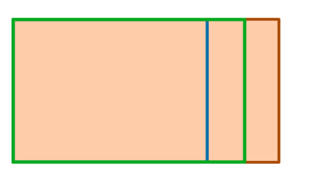
I just said that it will leave empty space on the right side of the screen??? Why? Because the game is scrolling from right to left and hence you’ve initially positioned your graphic as (0,height/2)
(NOTE: AGAIN… the entire orange part is ONE graphic that you’ll be importing in the game. Boundaries are just for the purpose to show how much portion of width would it come in the device with FIXED HEIGHT STRATEGY)
Now, you can always stack 2 background adjacent and find the when is the left background’s X position has moved less than (-background’s width) and if so then stack the background to the right of the other background. This logic would remain same for all aspect ratio devices for this kind of background art you made.
STEP 5:
Designing MENU:
I don’t know if you can change strategy in the middle of the game!! But let’s assume, you can’t. Now, since you’ve already set FIXED HEIGHT STRATEGY… You’ll have to be consistent in drawing graphics.
SO, for Menu, you would be designing like below
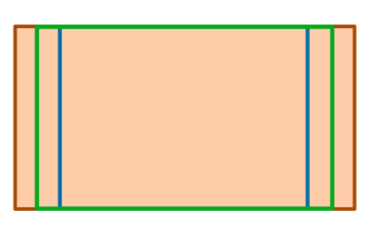
(NOTE, Here you should center position your background with (width/2, height/2) and not like you did for scrolling background.)
STEP6:
Post your code in case you need further help. And help back community in case you got things working as a gesture of thanks to community and also because you’re happy.
STEP7:
BUTTONS and other elements-Picking FIXED HEIGHT/WIDTH STRATEGY maintains aspect ratio of the game assets hence no other worries to keep in mind, just draw and position them.
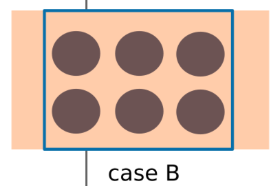
1) To be designed keeping in mind the smallest aspect ratio device you target, so that they don’t appear too cluttered on some devices like below:
For example, for MENU
If you designed your assets according to aspect ratio which has bigger width then it would look fine.
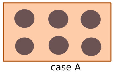
But for other aspect ratio devices whose width is smaller, the same elements would look like
Cluttered, right??
**NOTE:**As I said, area within boundary is actual device area but since we are having only one orange coloured background art for all aspect ratio devices which is centre positioned in this case, hence the extra width area of background art is going outside. So, another point is, we should design our one single background art such that main elements in the drawing which you want user to see, should come fine!
Example:
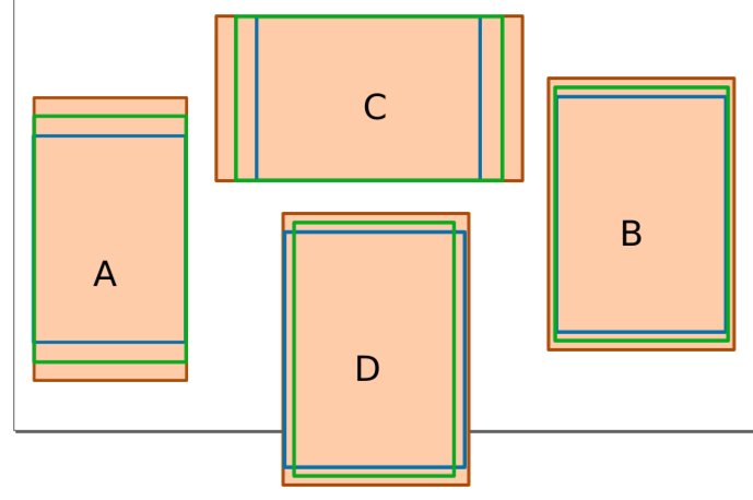
In case A, B and C, you should design your elements inside the blue area but in case D, none of them is shortest, so make them inside the interaction area(which is according to shortest height and shortest width)
2) To be positioned accordingly NOT by fixed coordinates but depending upon width and height like width/2 width/3, height/3, height/6 etc.
STEP8:
Now, when you’ve learnt enough with HD graphics, you can try auto selecting the best type of graphic assets, whether ldpi, mdpi, hdpi, xhdpi, depending upon the ACTUAL WIDTH/HEIGHT of device.
Setting resource directory would help to pick correct folder of assets on run time.
Check these links also:
http://cocos2d-x.org/wiki/Detailed_explanation_of_Cocos2d-x_Multi-resolution_adaptation
STEP9:
Conclusion:
These things depends upon:
- Game Type
- How you want this kind of game to look
- Design your game art according to strategy being picked
- Code according to whatever strategy is picked and also the way you designed your art like in the case of background I told you how you must scroll the background which would work fine for any aspect ratio.
Hence, there is not generalized solution, you will ever get!
I would suggest you to pick only those strategies which maintains aspect ration of graphics to make your world simpler!
EXTRA TIPS: Incase, you want the background to shake in vertical manner due to some collission,
then two things in mind.
-
Make the height of the graphic a little bigger on both above and bottom ends. Change the strategy/policy of FIXED HEIGHT to your manual using kResolution and those things I gave in very first link. And now, you can shake the background in vertical direction without worrying that black sides might shown up
-
Easiest is, keep FIXED HEIGHT policy and also keep your main background art same as you would have already drawn. But make one more background which will actually shake, this will also give you parallax effect.
(Note, in both cases, your entire elements on the screen also will shake but how?? You actually have to shake whatever layers you want to shake EXCEPT the main background layer. Rest, the layer will automatically take care of it children to shake)
Interesting, right? It would be. As complexity increase and depending upon kind of game, we think differently but basic concepts remains same.
PS: You don’t have all resources but you’ve enough resources to get going.
PS2: It’s a big material I wrote, so Suggest edit in case found something wrong.
7 Likes
I will put it on the list for the Programmers Guide.
1 Like
@slackmoehrle
If it is worthy then sure you can put it in there Thanks
But @Meir_yanovich merely reading is not enough, please apply the concepts