
Note: I wrote this tutorial in some details so that beginners can follow along. If you already have experiences with Cocos Creator, please skip directly to “Solution Section”.
Takeaway: Learn how to use Canvas, Widget components. Learn how to make your game layout responsive to various screen sizes.
Downloads:
Background.jpg (65 KB)
Profile.png (23 KB)
Responsive.zip (1.1 MB)
ResponsiveWithPhysics.zip (1.2 MB)
Understanding the Canvas Component
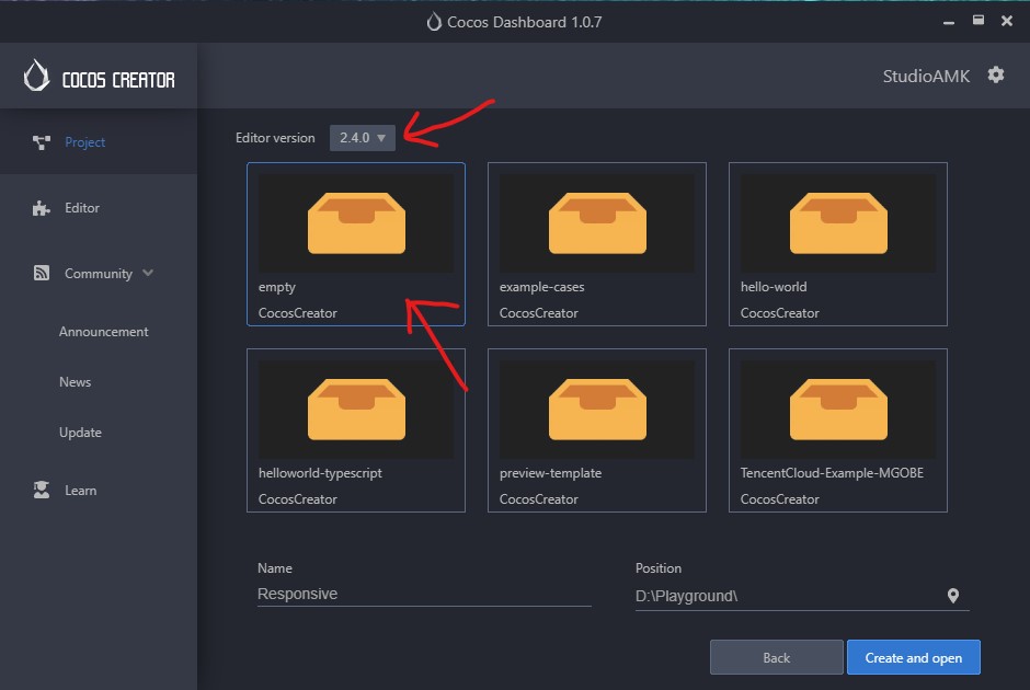
Let’s start by downloading the “Background” and “Profile” images provided. Next, let’s create a new project and then select the empty project. I will be using Cocos Creator 2.4.0 and I suggest we use the same version.
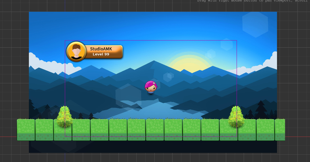
Once everything is ready, let’s select the Canvas node at the Node Tree window.
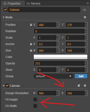
The Canvas component defines the resolution of our game (width and height). Let’s say, we want our game with the resolution 960x540 (16:9), we just adjust its width and height properties at the Properties window as follows. For now, let’s turn off both Fit Width and Fit Height options.
Now, let’s add an image to be used as our game content by just dragging and dropping the “Background.jpg” file that we’ve downloaded into the Assets window (if you want to use your own image, it would be better if the image size is 960 x 540 to match our game’s resolution). After that, drag that image to Node Tree and place it under the Canvas node. And adjust the Background Node’s position and size to fill the game scene. Also, let’s assume that the Background node represents our game content and all of the image must be visible at all times on any device. This would be the goal of this tutorial.
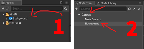
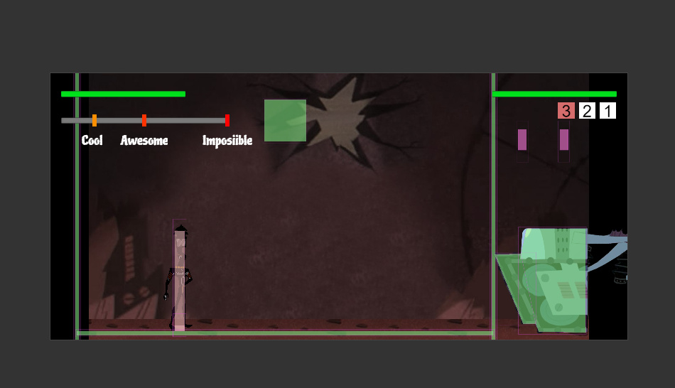
Again, add another image (Profile.png) below the background node, just to demonstrate an element inside our game. Place it at a corner. So, we should have something similar to the below image.
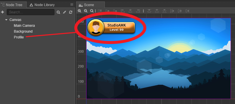
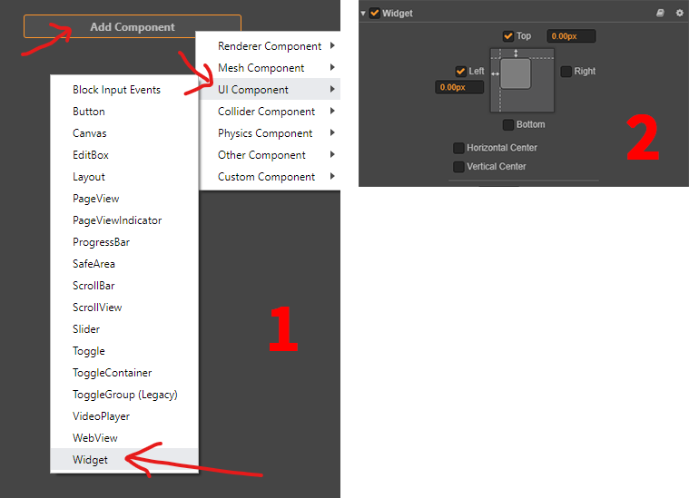
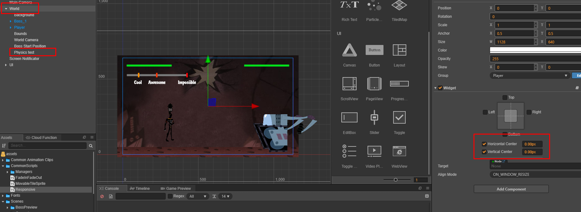
To make the profile image stick to the top left corner, let’s add the widget component to it and enable its top and right properties with 0s as follows.
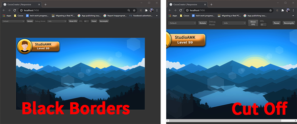
Let’s run the game, we will have the game with exactly the size we’ve given. However, when we run on a device where the resolution is higher than our game, we will get the black borders around the game. When the device’s resolution is smaller than our game, our game content will be cut off. To simulate this try adjusting the browser window to various sizes.
Understanding the “Fit Width” and “Fit Height” Canvas options
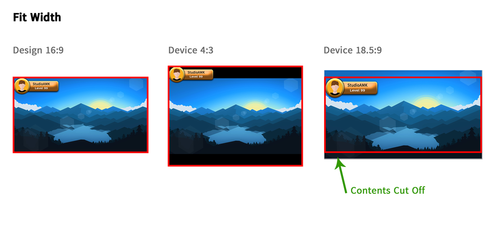
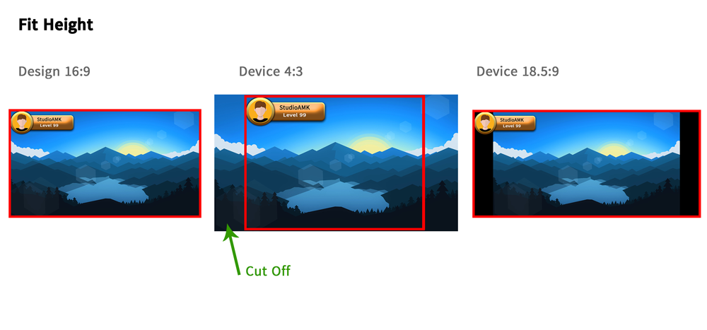
Enabling a Canvas’s “Fit Width” option will scale up/down the game until the game width fits the device’s screen width. Then, the game height is adjusted. Below is the example of 16:9 design on 4:3 and 18:9 devices with “Fit Width” enabled. We can also observe that our “Profile” node is always at the top left corner regardless of the screen sizes. The Widget component that we’ve added earlier is working well. However, as we said early, the game contents being cut off is not acceptable. Therefore, “Fit Width” is not usable if the device width ratio is larger than our design ratio.
As in above, enabling “Fit Height” will scale up/down the game until game height fits the device’s screen height. Below is the example of 16:9 design on 4:3 and 18:9 devices with “Fit Height” enabled. Again, “Fit Height” is not suitable if the device height ratio is taller than our design ratio.
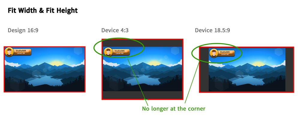
Enabling both options will proportionally scale up/down the game until both game’s height and width fit within the device’s screen. In another word, this forces the canvas/game size to be the same aspect ratio as our design ratio. Therefore, Widgets couldn’t go beyond the canvas. This’s why, in this example, our profile node with Widget is no longer at the corner.
Therefore, as we can see from above examples, there is no perfect solution for different screen sizes just by changing those Canvas’ options from the editor.
Solution: Let’s Fix It!
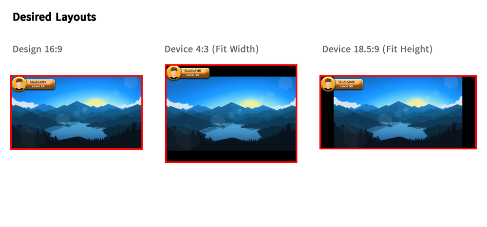
Now, we know which option works well for which device ratio. So, let’s go back to the above test cases and let’s pick the desired outcome for each case. In this example, on a 4:3 device, we should use “Fit Width” and on a 18.5:9 device, “Fit Height”. Now, we will try to achieve this by dynamically adjusting Fit Width and Fit Height options based on device aspect ratio.
First, let’s find out what our game resolution ratio (let’s call it the desired ratio) is. Basically, we can just divide the Canvas Width by the Canvas height. In this tutorial, our desired ratio is 1.78 (960 / 540).
Now, let’s work on another ratio, the device ratio, by dividing the device width by the device height. If a device is with a larger width, the device ratio will be larger. Eg: for a device with 1280x540, the device ratio is 1280 / 540 = 2.37. In another word, if the device ratio is larger than our desired ratio, we can say that we have a device with larger width. So, for a larger width device, we should use “Fit Height”.
Same as the width calculation, if the device ratio is smaller than our desired ratio, we have a device with taller height. So, for a taller height device, we should use “Fit Width”.
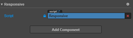
Now, let’s code above logic into a script called Responsive.js as follow and execute it at component’s onLoad method:
makeResponsive() {
    let canvas = this.node.getComponent(cc.Canvas);
    let deviceResolution = cc.view.getFrameSize();

    // calculte design ratio
    let desiredRatio = canvas.designResolution.width / canvas.designResolution.height;
    // calculte device ratio
    let deviceRatio = deviceResolution.width / deviceResolution.height;

    if (deviceRatio >= desiredRatio) {
        canvas.fitHeight = true;
        canvas.fitWidth = false;
    } else if (deviceRatio < desiredRatio) {
        canvas.fitHeight = false;
        canvas.fitWidth = true;
    }
},

onLoad() {
    this.makeResponsive();
},
Let’s add that script to the Canvas Node and let’s run again.
Finally! We have a responsive Game!
Update: Physics Objects Fixes
Original responsive logic had an issue with physic objects. Since we changed “Fit Width/Height” after the physics objects were loaded, all of their positions messed up. So, the approach is very simple,
- Before enabling PhysicsManager, we make our game responsive.
- Disable the game objects with Physics
- Enable PhysicManager
- Re-enable the game objects with Physics on the next trick or a callback.
Check above download section for updated sample project.
Thanks @Horchynskyi for the bug! 
Screenshots of Responsive Physics Game
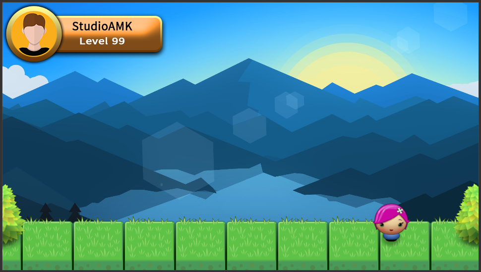
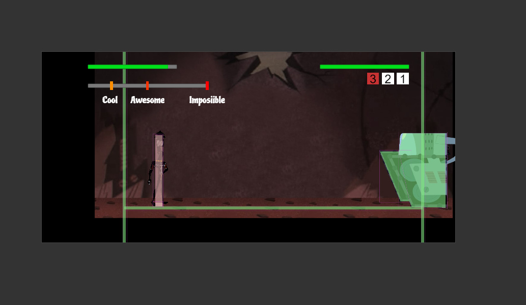
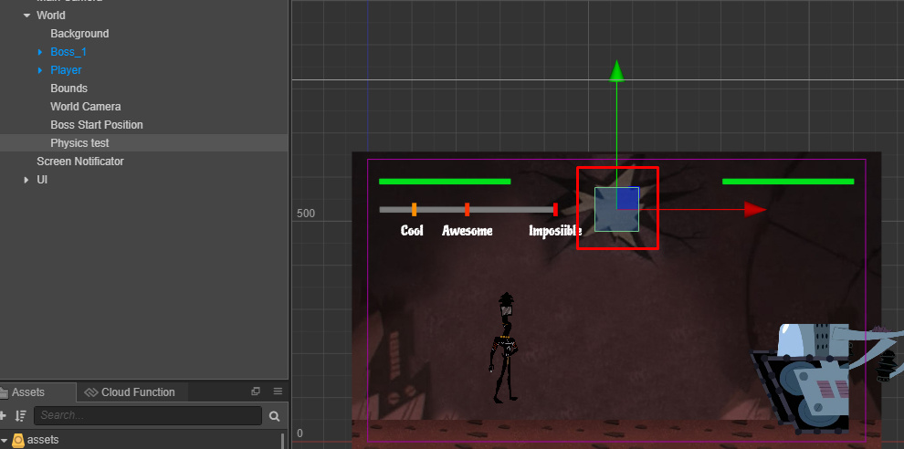
Design Layout:
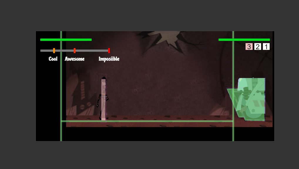
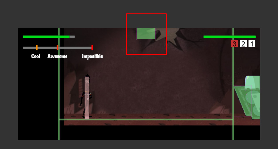
On 16:9 Device:
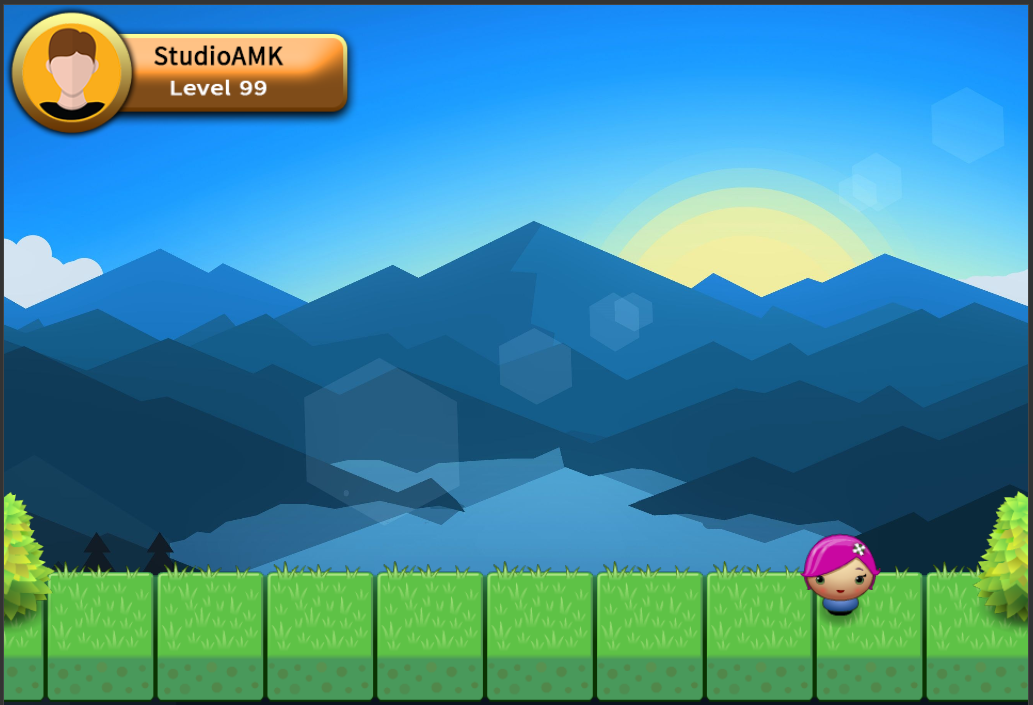
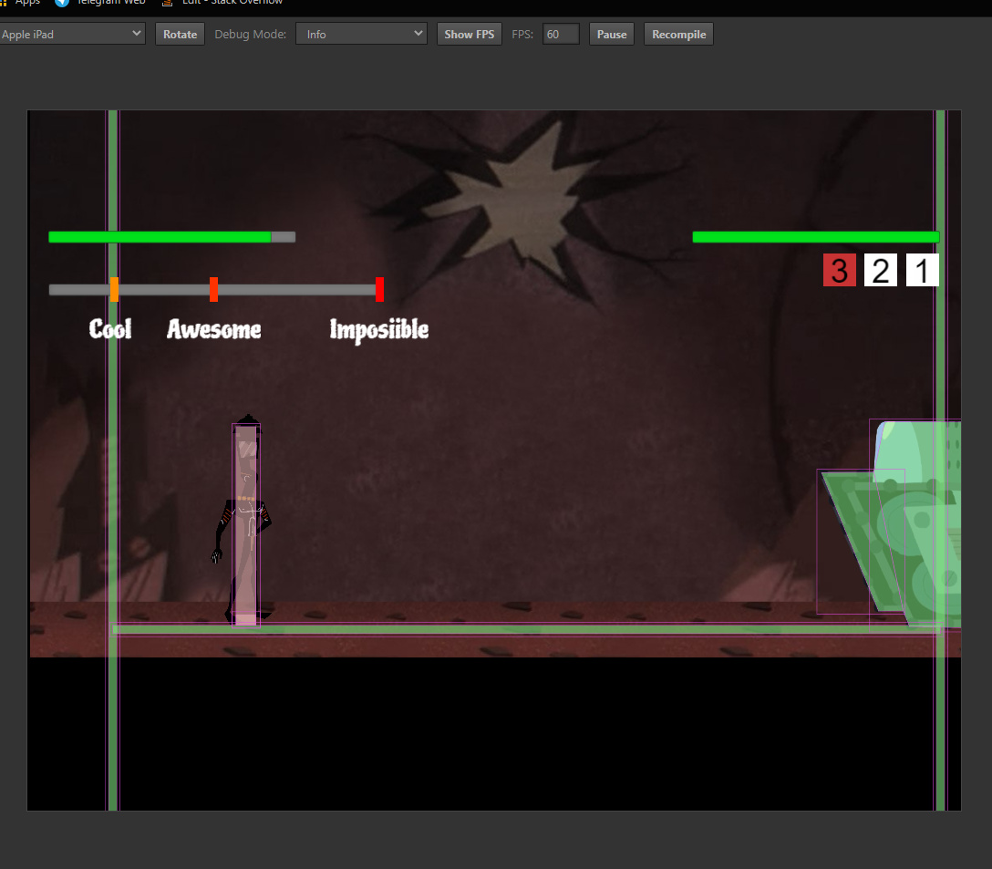
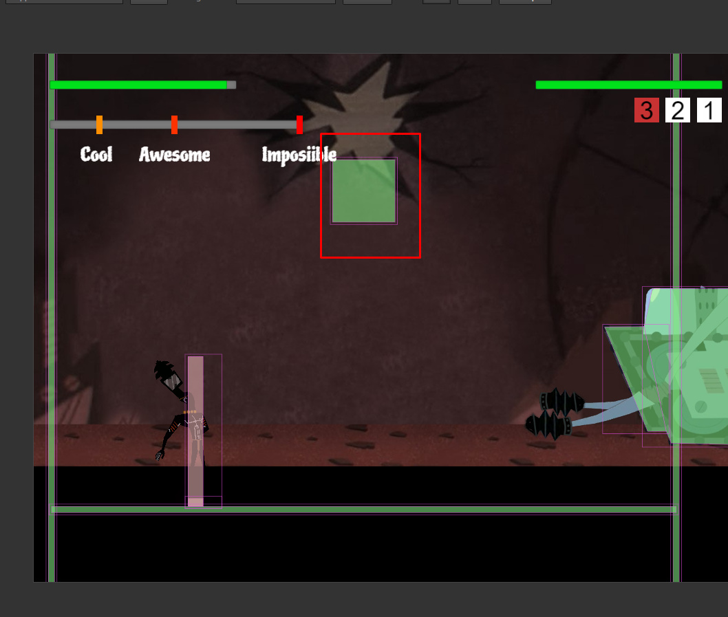
On 4:3 Device (iPad):
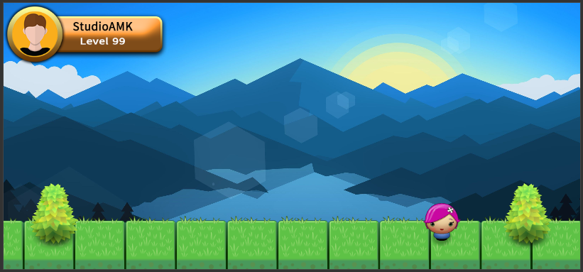
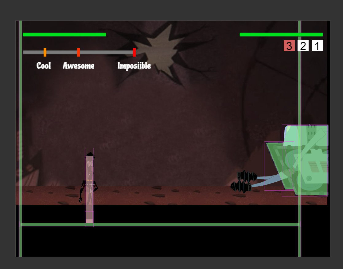
On 13:6 Device (iPhoneX):