Improving multi-device adaptation
The following article is from Tencent IMWeb front-end team member, Grey. We thank them for allowing us to share this article with all developers.
Tencent IMWeb front-end team.
The IMWeb front-end community gathers many front-end development enthusiasts to discuss issues and improve their work in their projects.
Front-end developers usually use media queries or rem for multi-end adaptation, but CSS doesn’t exist in Cocos Creator. Starting from the demo example, this article will help you to appreciate the multi-end adaptation of Cocos Creator.
Background
One day I received a new request, and I felt a lot of pressure after reading the design draft given by my design co-worker. They gave me four different devices and how they should look on each. After looking, I analyzed the following main difficulties:
- The background of the game should be the same background image on all devices, and side images in the background image should be displayed on both ends, no matter the screen size.
- The countdown on the title bar, the distance of the title, and the minimize button are different sizes.
- The background image behind the text needs to be automatically stretched according to the length of the text while ensuring that the rounded corners on both sides are not stretched.
If this adaptation scheme is implemented using CSS, a lot of media queries are definitely indispensable. CSS implementation is more familiar for a front-end developer, but it also leads to tedious and cumbersome style code, which is torturous for developers. In the past few years, the Cocos Creator game engine has been introduced to implement better functionality. The CSS that we used to be familiar with will no longer exist in Cocos Creator. How do we implement this multi-end adaptation on Cocos Creator?
Analysis
In response to this requirement, we split the adaptation process into the following points:
- Multi-device adaptation of the background image
- Multi-device adaption of the nodes
- Nine-box cutting of the background picture
Multi-device adaptation of the background image
What are design resolution and screen resolution?
To make a multi-device adaptation on Cocos Creator, you need to understand design and screen resolution. According to the official documentation, the design resolution is the blueprint of the resolution used by the content producer when creating the scene. The screen resolution is the actual screen display resolution when the game runs on the device. The design resolution is actually the size that the design developers use in most of their design draft development. Generally speaking, it is 667*375 of iPhone 6. Almost all design drafts are drawn in this size. Different devices (PC, iPad, iPhone X, etc.) are separately produced with suitable design drawings. Therefore, the canvas size in Cocos is usually set to a design resolution of 667 in width and 375 in height, and basic function development is completed at this resolution.
What is the relationship between design resolution and screen resolution?
Assuming that our design and screen resolutions are both 667 x 375, the canvas can fit the screen perfectly without scaling. Suppose our design resolution is 667 x 375, and the actual screen resolution is 1334 x 750? At that time, the canvas needs to be enlarged twice to be able to fit the screen perfectly. When the canvas zooms in, all nodes in the scene can enjoy intelligent zooming based on the design resolution.
Fit Height and Fit Width
In the example given in the previous point, when the design resolution is 667 x 375 and the screen resolution is 1334 x 750, the scene needs to be enlarged twice to fit the screen perfectly. Still, the premise for this is the design resolution and screen resolution and that the aspect ratio is the same. Assuming that the aspect ratio of the design resolution is inconsistent with the aspect ratio of the screen resolution (this is a common problem in multi-device adaptation), what should I do now? The canvas component provides two adaptation modes, Fit Height and Fit Width, to help us solve them. How to understand these two adaptation modes?
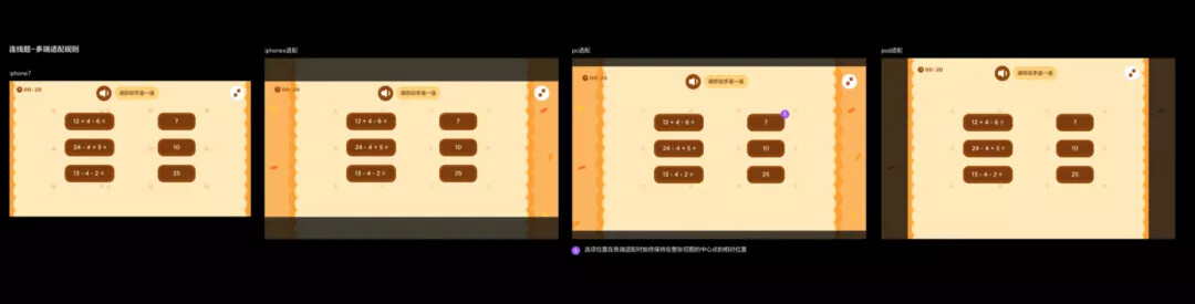
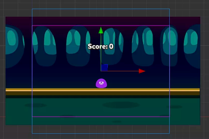
We use the following scene as the introductory scene, the purple frame is our design resolution, and the blue frame is the actual scene:

Let’s look at the situation where the screen resolution aspect ratio is smaller than the design resolution aspect ratio (Like an iPad).
We first set to Fit Height mode to see the effect. We will find that the height of the design resolution will automatically fill the screen height, and because the screen resolution aspect ratio is smaller than the design resolution, a part of the background image will also be cut off on both sides of the screen.

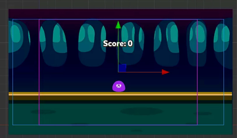
Let’s set it to Fit Width mode to see the effect. We will find that the width of the design resolution will automatically fill the screen’s width, and because the screen resolution aspect ratio is smaller than the design resolution, a part of the background image will be displayed on the top and bottom of the screen.
Look at the case where the screen resolution aspect ratio is greater than the design resolution aspect ratio. (iPhone X, for example)
We first set Fit Height mode to see the effect. We will find that the height of the design resolution will automatically fill the screen height, and because the screen resolution aspect ratio is larger than the design resolution, a part of the background image will also be displayed on both sides of the screen.
We set it to Fit Width mode to see the effect. We will find that the width of the design resolution will automatically fill the screen’s width, and because the screen resolution aspect ratio is larger than the design resolution, part of the background image will be cut off from the top and bottom of the screen.
What mode is used for background multi-device adaptation?
After explaining the two modes of Fit Height and Fit Width above, can you determine which mode is used for each example in the first picture of this article? When the screen resolution aspect ratio is smaller than the design resolution aspect ratio (in the case of an iPad), we hope to display more background areas on the upper and lower sides with the same width. At this time, we need to use Fit Width. When the aspect ratio is greater than the design resolution aspect ratio (in the case of iPhone X), we hope to display more background areas on the left and right sides with the same height. At this time, we need to use Fit Height.
In the code, we can get the aspect ratio of the actual screen resolution by obtaining the current view size and decide whether to use the Fit Height mode or the Fit Width mode according to the aspect ratio.
Export function  setCanvasScaleMode ( Canvas: cc.Canvas ) {
  const standardRadio = 16/9 ; // standard aspect ratio, the aspect ratio is almost iPhone6 (landscape), generally as a standard design draft   const screenSize = cc.view .getFrameSize();
  const currentRadio = screenSize.width / screenSize.height; // aspect ratio   if (currentRadio <= standardRadio) {
    // a square screen, which means iPad or the like.
    canvas.fitHeight = false ;
    canvas.fitWidth = true ;
  } else {
    // Longer screen means ipx. Too long, the height appears small, so the priority is to fit the height
     canvas.fitWidth = false;
    canvas.fitHeight = true;
  }
}
After determining the mode, we also need to ensure that the background does not appear black because when the Fit Width mode is used in the iPad, more background areas will be displayed on the upper and lower sides. If the background image is not so high, the upper and lower sides will have black borders appear. For the same reason, when the Fit Height mode is used in iPhone X, more background areas will be displayed on the left and right sides. If the background image isn’t that wide, there will be black borders on the left and right sides. At this time, we need to design the background image provided by the workmate to cover the height of the iPad and the width of the iPhone X. The background image should be larger than the design resolution, and a certain length should be reserved in the four directions of up, down, left, and right to ensure that black borders don’t appear in the background does not fit.
Special cases
Detailed developers may have discovered that the aspect ratio of the PC side and the iPhone7 side are actually the same sizes. According to our above idea, the two ends should display the same background area. At the same time, because the PC side’s aspect ratio is larger than the iPhone7’s width and height, and all the nodes in the scene can enjoy scaling the resolution based on intelligent design, the nodes should be larger than the PC side, than the nodes for iPhone7. However, the first design drawing requires the PC to occupy more background area, and the size of the nodes in it is also the same as the size of the nodes in the iPhone 7 to ensure a beautiful display on the PC. It is necessary to individually adapt to the situation on the PC side and scale down both the background image and the nodes.
Multi-device adaption of nodes
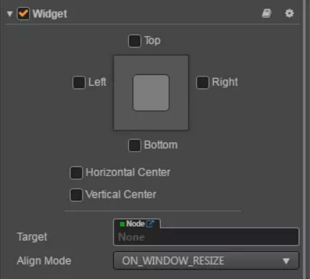
What is the Widget component?
The Widget component is a UI layout component in Cocos. It is used to align the current node to any position of the parent node. By setting various values of the Widget component, the nodes can be aligned to the upper boundary, the lower boundary, the left boundary, and the right boundary. The horizontal direction and the vertical direction are centered. The Widget component is the best choice when nodes in the scene need to be edged.
Which node is used as the parent node of the node alignment?
When a node needs to be edged, we hope that no matter how the screen resolution changes, the node will always appear in a fixed position on the screen. For example, the countdown node in the first design draft, we hope that it can be fixed in the upper left corner of the screen under any screen resolutions, and it will not move to the upper right corner as the screen resolution changes. Therefore, the size of the parent node specified by the node must be the same as the size of the screen. Which node is the most suitable?
The answer is the canvas node! When we use the Fit Height and Fit Width modes, the canvas node will occupy the size of the screen. At this time, setting the edge distance of the node that needs to be edged relative to the canvas node is actually the edge distance setting relative to the screen.
Multi-end distance setting
According to the requirements of the design students, the distance of the node (such as the countdown node) on the PC side, iPad side, iPhone X side, and iPhone7 side are different. At this time, how do we set the distance according to different ends?
First of all, setting the distance of a multi-device node is just to change the alignment value of the node widget component in all directions, such as a countdown component. We first determine which device we’re using currently and then change the top of the widget component according to this device. And then the left value.
Since the setting logic of the widget needs to be executed on different edge nodes and needs to be executed on different ends of each edge node. There are many usage scenarios. So we can extract this logic as a general script component and add the required node separately. The following is a UIAdaptor script component we extracted:
@ccclassexportdefaultclass UIAdaptor extends cc.Component {

    @property({
        type: Number,
        tooltip: `app: ${PlatformTypes.APP}, iPad: ${PlatformTypes.iPad},  PC : ${PlatformTypes. PC }, iPhoneX: ${PlatformTypes.iPhoneX}, AndroidiPad: ${PlatformTypes.AndroidiPad}`,
    })

    platform: PlatformTypes = -1;

    @property({
        type: [Number],
        tooltip: 'left, top, right, bottom, horizontalCenter, verticalCenter',
    })

    widgetOptions: Array<number> = [
        Number.MAX_SAFE_INTEGER, Number.MAX_SAFE_INTEGER, Number.MAX_SAFE_INTEGER, Number.MAX_SAFE_INTEGER,
        Number.MAX_SAFE_INTEGER, Number.MAX_SAFE_INTEGER,
    ];

    @property({
        type: Number,
        tooltip: `ONCE: ${WidgetAlignModes.ONCE}, ON_WINDOW_RESIZE: ${WidgetAlignModes.ON_WINDOW_RESIZE}
      ALWAYS: ${WidgetAlignModes.ALWAYS}
    `,
    })

    widgetAlignModes = WidgetAlignModes.ON_WINDOW_RESIZE;

    @property({
        type: [Number],
        tooltip: 'width, height',
    })
    size: Array<number> = [];

    @property({
        type: [Number],
        tooltip: 'x, y',
    })
    scale: Array<number> = [];

    @property({
        type: Number,
    })

    fontSize = -1;

    // Adapting the widget component of a node  private fitWidget() {
    const widget = this.getComponent(cc.Widget);
    if (!widget) {
        return;
    }

    enum WidgetOptions {
      left,
      top,
      right,
      bottom,
      horizontalCenter,
      verticalCenter,
    }

    this.widgetOptions.forEach((value: number, index: number) => {
      if (typeof value !== 'number' || value >= Number.MAX_SAFE_INTEGER - 1) {
        return;
      }

      const optionType = WidgetOptions[index];
      widget[optionType] = value;
      widget[`isAlign${optionType.replace(optionType[0], optionType[0].toUpperCase())}`] = true;

    });

    widget.alignMode = this.widgetAlignModes;

  }

    // Adaptation of node size  private fitSize() {
    const [width, height] = this.size;
    this.node.setContentSize(
      width,
      height
    );
  }

    // Adapt the font size of the node
    private fitFontSize () {
        const label = this .getComponent(cc.Label);
        label.fontSize = this .fontSize;
    }

    // Yes The scale of the node is adapted
    private fitScale () {
        const { scaleX : originalScaleX, scaleY : originalScaleY} = this .node;
        const [x, y = x] = this .scale;
        this .node.setScale(originalScaleX * x, originalScaleY * y);
  }

  privatefit() {
    if (this.size.length) {
      this.fitSize();
    }

    if (this.fontSize >= 0) {
      this.fitFontSize();
    }

    if (this.scale.length) {
      this.fitScale();
    }

    this.fitWidget();

    const widget = this.getComponent(cc.Widget);
    if (widget) {
      widget.updateAlignment();
    }
  }

  start() {
    // Get the end where the current scene is located
    const platform = getPlatformType();
    if (platform === this.platform) {
      this.fit();
    }
  }
}
You can see that this script component can set the Widget component of the node and set the size, scale, fontSize, etc., of the node. Using this script component, you can set the multi-device node’s distance, size, zoom, etc. Let’s look back at the countdown node just mentioned. What will it look like after using the UIAdaptor script component?
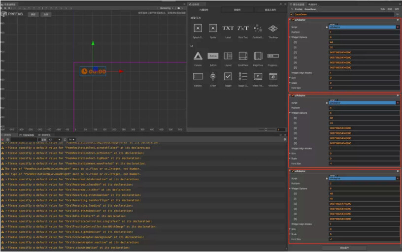
Since the distance of the countdown node on each end is different, we add a UIAdaptor script component to the countdown node for each end and fill in different devices (PC, iPhone X, iPad, Android iPad) and Widget options (left, top, right, bottom, horizontalCenter, verticalCenter). When the scene is loaded and executed to these scripts, it will be judged whether the end of the current scene is consistent with the end selected by UIAdaptor. If it is not, skip it. If it is, fill it in with the value. In this way, we can achieve multi-device adaptation of the nodes without added code.
Nine-box cutting of the background image
Why do you need to deal with the background image?
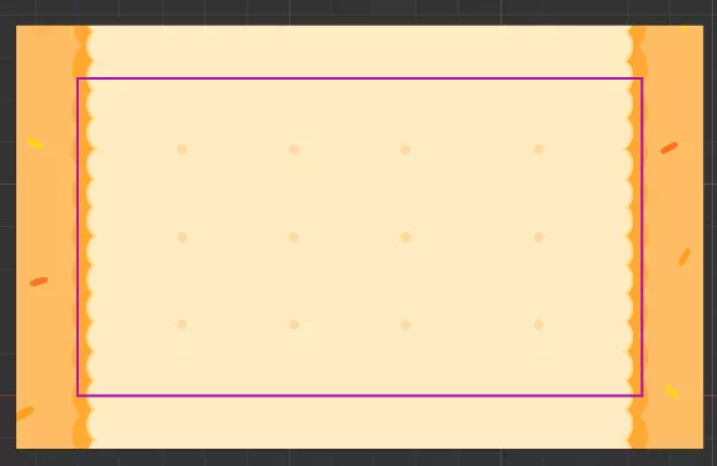
The design workmate will give a cut-out for text in the first design draft. The cut-out length looks like this:
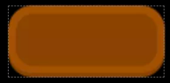
If we don’t do any processing on the image, just throw it into the game and let it automatically stretch according to the length of the text; what will happen?
It can be seen that when the length of the option is considerable, the background image of the option shows a bizarre shape, and the four rounded corners are stretched out. If the UI designer sees it, they may complain about it. We hope that no matter how long the option is, the four rounded corners can remain in the original state and will not be affected by the length of the option, and this unprocessed picture obviously does not meet our needs.
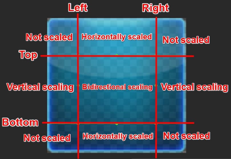
What is Nine-box cutting?
To allow developers to make UI images that can be stretched arbitrarily, Cocos Creator provides a nine-grid cutting method for image resources. When we select the image resource for editing in Cocos Creator, a pop-up window for editing the image will appear:

Here we can move the green line to cut the image resource into nine parts, and the stretching rules for each part are as follows:
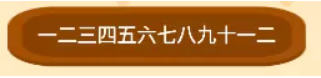
We cut the four rounded corners of the options button to the four corners of the Nine-cut box so that no matter how the option is stretched, the four rounded corners can always maintain the original state and will not be scaled or stretched due to the change in the length of the option. Let’s take a look at the effect of cutting the image resource into a nine-square grid:
Well, doesn’t this option seem to be better than before?
Precautions for cutting the box
Generally speaking, design developers will provide a cutout, making you double and triple the cut. When choosing the options button cutout, it is best to choose a multiple of the button with a similar size to the design resolution. Suppose the button cutout has a height of 44, a height of 88, and a height of 132, and the height of the button at the design resolution is 88, then we should choose the button cutout’s double.
If we choose the double image for the nine-box cut, the four rounded corners will also become small due to the small size of the double image, as follows.
If you choose a doubled image to do the nine-square grid cutting because the size of the doubled image is too small, the four rounded corners will also become very small, as shown in the following figure:
If you choose a triple cut of the nine-square grid, because the size of the triple image is too large, the four rounded corners will also become very large, as shown in the following figure: