
Hi,
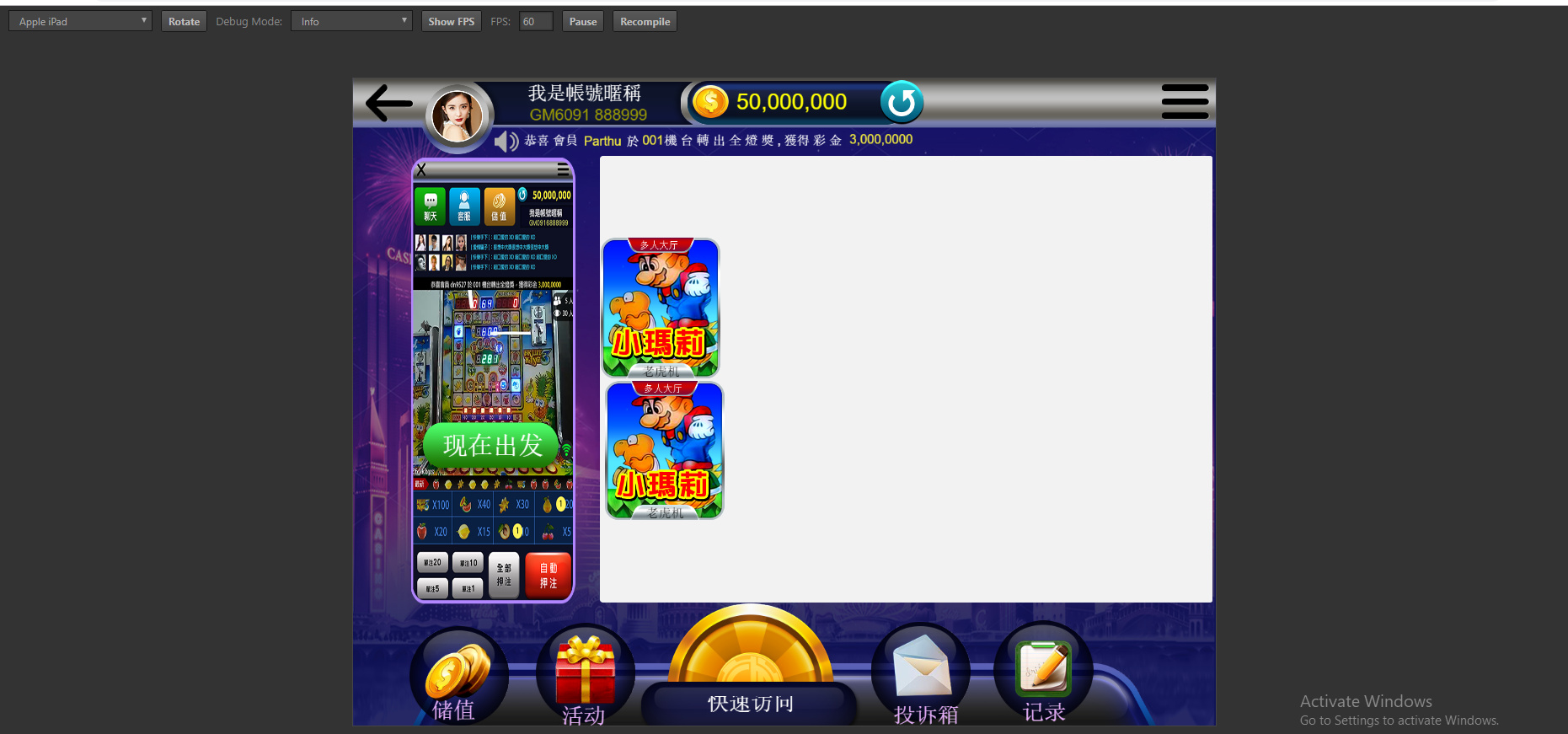
Its possible to Same view for all devices using cocos creator and if yes then please give me some demo code or example for that.
But when i change other screen image stretch and also try out resolution policy but its doesn’t work.
I think that what you need is to apply the widget component to you nodes with sprites
https://docs.cocos2d-x.org/creator/manual/en/components/widget.html
When i using widget image stretch
If you want your image to keep its position without stretching I think you have to select all the checkboxes (top, bottom left & right)
If you use two opposite sides for alignment, then it will stretch in this direction to meet the widget conditions.
e.g. a node should be 10px from top and bottom. On a 100px high screen, it would have height 80, on a 200px high screen, it would have height 180.
So checking all the boxes would result in stretching images in both directions, based on the aspect ratio of the device.
Are you using fitHeight or fitWidth in your canvas component?
And do you need the picture on the left side to go from bottom to top?
Otherwise for the left picture, you could just check the left checkbox and maybe the vertical center checkbox.
For the other two pictures inside the white square: Are those child nodes of the white square?


I see.
If you would use fitHeight, those two pictures should look better, but I don’t know how your other UI elements will react.
If this doesn’t do it, I am out of ideas, sorry.
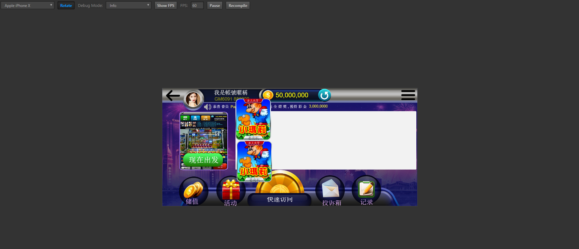
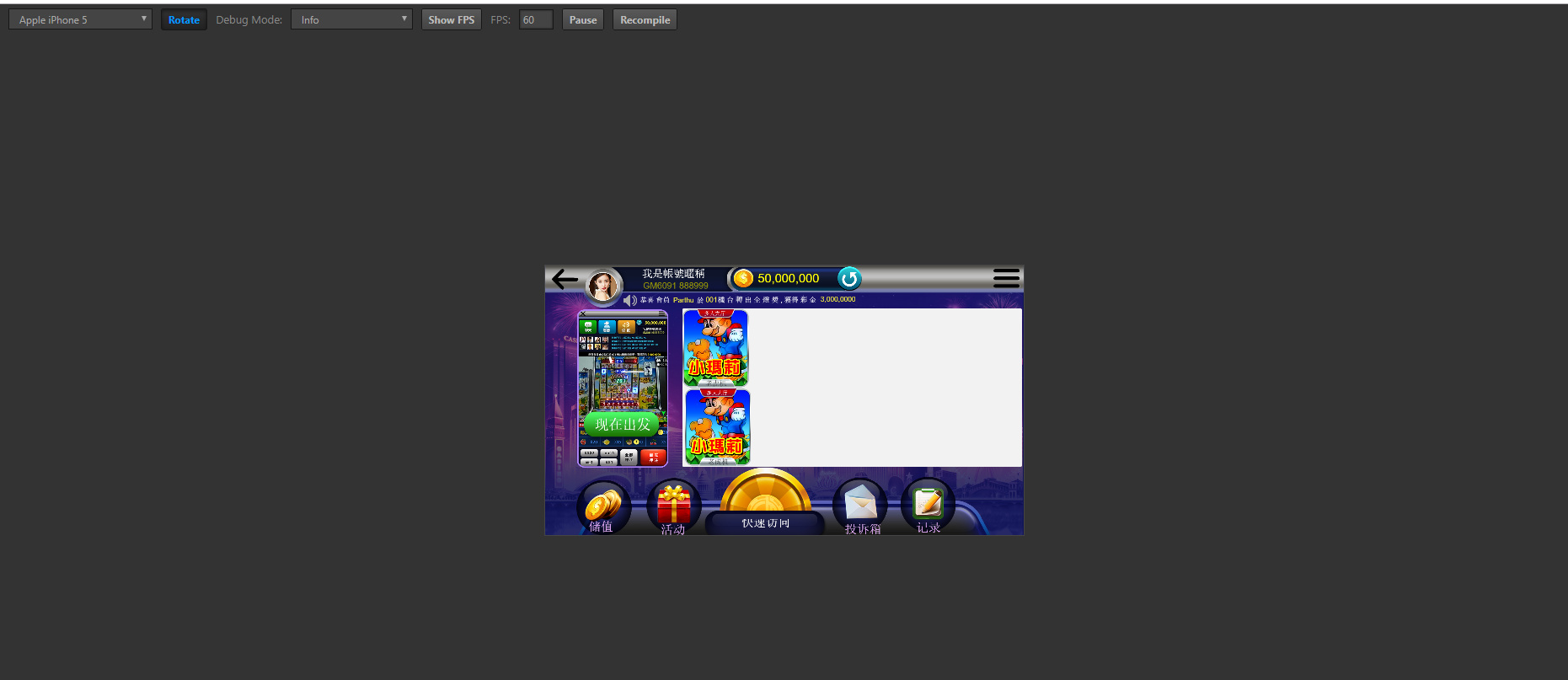
I tried fitHeight its look better but in ipad other UI cut from view.
FitHeight means that the height will be “the same” but it will cut the width.
What you should do is check fitHeight and use the Widget component to keep the UI elements positions.
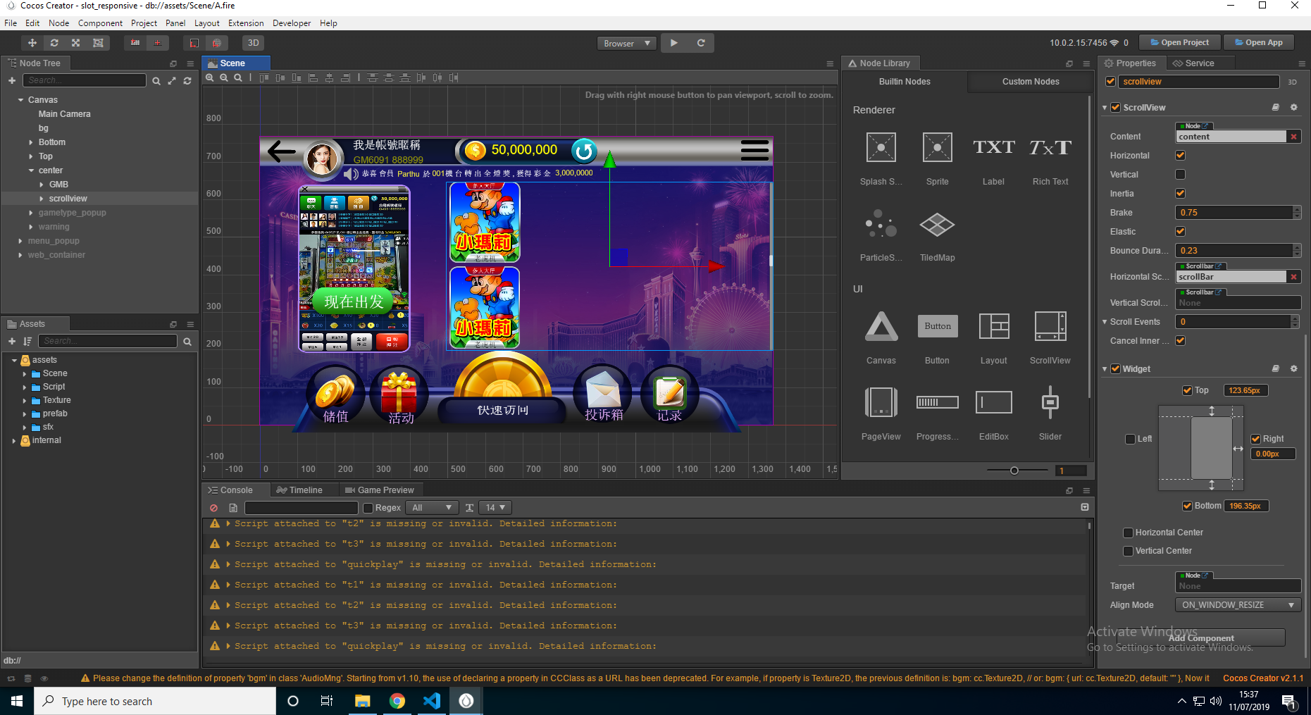
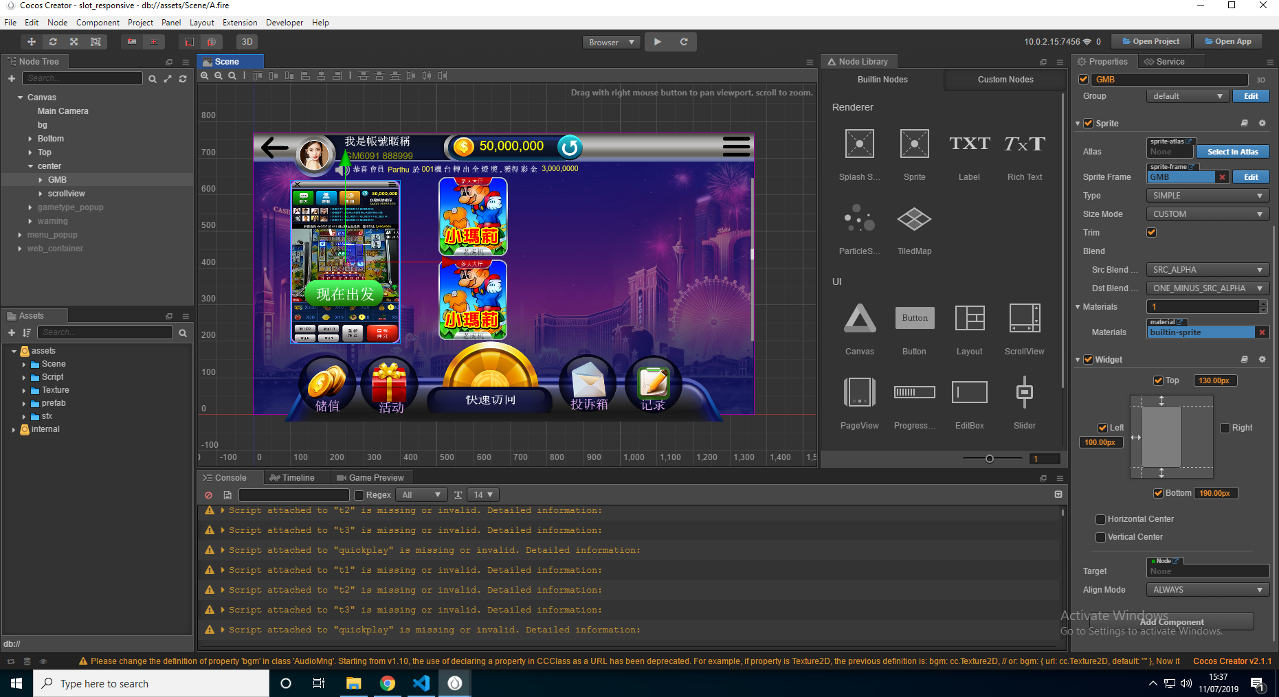

If you want the scroll view to align next to the GMB, you should check the left property on both. But in your case I think you should be good with checking left and right on the scrollview, so it will cover the rest of the screen, no matter how width the screen actually is.