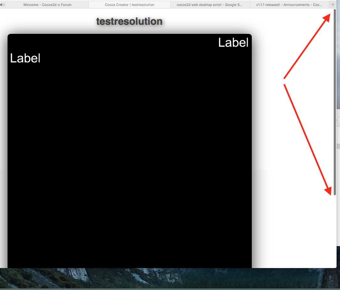
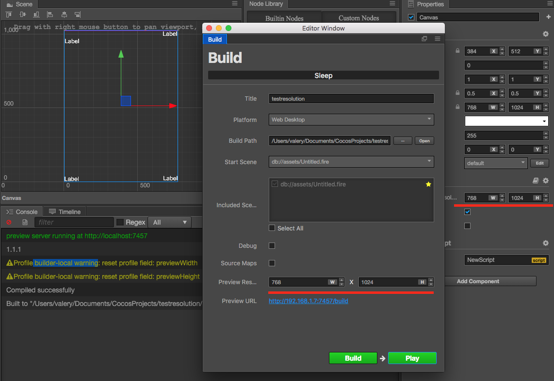
I created simple project, added 4 labels to the corners, changed “design resolution” to 768x1024, built the project setting “Preview Res…” to 768x1024.
When I ran it, the bottom of my scene was not visible. I have to scroll the page to see it.
So my scene was not resized to browser screen size.
I have a game created by Cocos Studio. For browsers (not mobile), I use the code:
var resolution = cc.ResolutionPolicy.SHOW_ALL;
cc.view.setDesignResolutionSize(768, 1024, resolution);
cc.view.resizeWithBrowserSize(true);
As the result, whole game is on the screen with black boxes on the left/right and without scrolling.
But when I change browser size, the game’s view is resized automatically and it saves the aspect ration 768:1024.