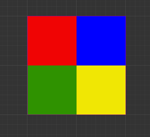
If Design resolution is 1000 x 1000 and I have nodes 250 x 250 (4 nodes side by side and 4 nodes top to bottom).
I run the project with a screen resolution is for example 500 x 500 I would expect my nodes to be 125 x 125 to fit into the resolution 4x4:
Small Problem:
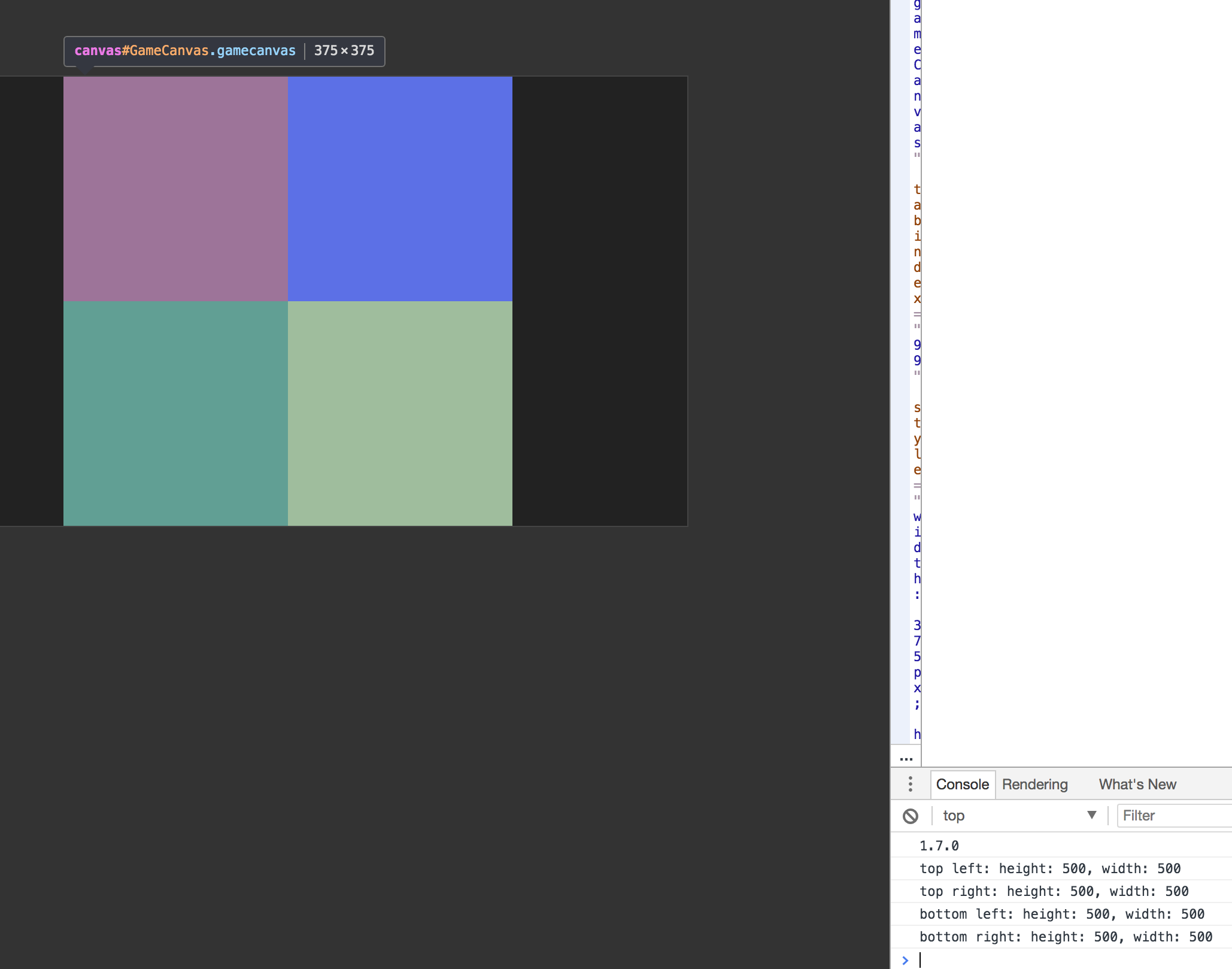
If I check the node height and width in my 500 x 500 screen resolution it will still be 250 x 250 in size.
the 250 x 250 node will not represent a real 250px in height and width - instead it matches 125x125 since it fits 4 times on width and height in a 500 x 500 screen resolution, even though it says it is 250 x 250 in size.
Big Problem:
I want to optimise the sprite size I load into the view. If the resolution is 500 x 500 I want to load 125 x 125 images to fit them 4x4 into the view. But if I place 125 x 125 sized images in the “fake” 250 x 250 node for 500 x 500 resolution, the image will actually represent a 125 x 125 sized image in a full 1000 x 1000 resolution screen, even though the screen resolution is 500 x 500. Meaning the 125x125 image will actually fit 1000/125=8 times, even though it should only fit 4 times.
Question for Solution:
How can I load in images with the exact size depending on resolution to save bandwidth on small resolution devices?
I hope you understand me and that this isn’t super confusing to understand. Please ask if you’re wondering about anything.
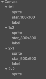
you should setup the sprites with the text 250x250 and then also ones with 1000x1000, 500x500 on them in an image editor, then setup the project like you have and take a screenshot so we can visualize the issue
Correct me if I’m wrong, but this is the desired behavior when using multi-resolution. You can define a design resolution which remains the same across all platforms so you can design your game independently of the actual screen resolution.
You can organize your assets in folders for all your supported resolutions and load the images for the actual resolution using FileUtils::setSearchPaths.
If your design resolution is 1000 x 1000 then you should design your sprites and size them to look how you want on 1000 x 1000. When you run your game on other size devices Cocos Creator will automatically size your game to fit that device.
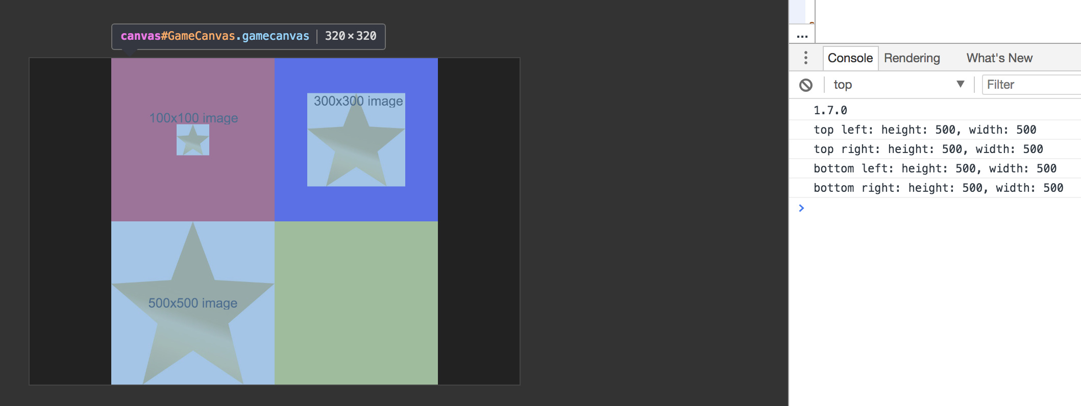
I would like to optimise and only download height / 2 and width / 2 images instead of full 500x500px images for a small screen size: But small fitting images won’t cover the area even though they are big enough:
What should I do to be able to automatically be able to fit in 320/2 ->160x160 images with full width and height in this scenario? I would not like to start resizing them manually. I would like it to be automatically filled depending on the user’s resolution.
In the last image the 100x100px star should almost cover 1/3 of the screen height and width. But it’s it covers only 1/10 of the screen because the screen is “pretending” to be 1000x1000.